| Use one clear CTA above the fold |
Overload with multiple buttons or links |
| Design for fast scanning (use large headlines & bold colors) |
Rely on dense paragraphs and tiny fonts |
| Apply high contrast for readability |
Use low contrast colors that blend together |
| Guide the eye with visual hierarchy (F or Z layout) |
Scatter important content randomly on the page |
| Use trust signals like testimonials and recognizable logos |
Assume people will trust you just because your product is good |
| Build engagement gradually (micro-commitments) |
Ask for too much info upfront (long forms) |
| Use simple, readable fonts like Arial or Roboto |
Choose gimmicky or hard-to-read fonts |
| Tailor colors and language to your audience |
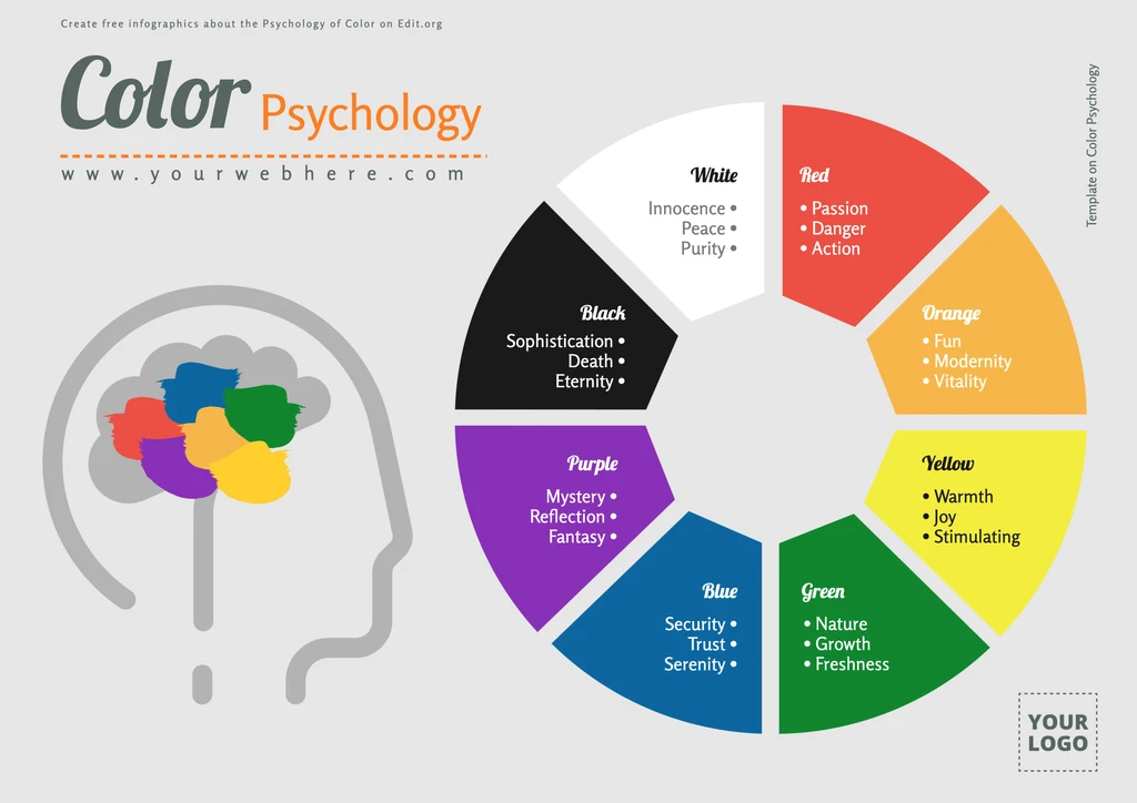
Assume color psychology is universal |
| Optimize for fast load time (under 3 seconds) |
Ignore performance—it’s just design, right? |
| Keep visitors focused (no popups or distractions) |
Clutter the screen with irrelevant offers |
| Track behavior (clicks, scroll depth, conversions) |
Guess what’s working and never measure anything |
| Test and update your page regularly |
Launch it and forget about it |

No comments:
Post a Comment